Before we talk about “Data Visualization,” let’s first understand “Data Science” as these two terms are related. In simple words, “Data Science” means analysing raw data using math and computer techniques to understand the information. But do you know what a “Data Science Pipeline” is?
Put simply, in data science, a pipeline is like a series of steps that take messy data from different places (like surveys, feedback, lists of purchases, votes, etc.) and transform it into a clear format. This makes it easier to store and analyse the data.If you’re looking to delve into the world of data science, considering a Data Science Course in Chennai could be a great way to acquire the necessary skills and knowledge.
The phases that the raw data goes through in a pipeline are as follows:
- Data Visualization
- Fetching/Getting the Data
- Scrubbing/Cleaning the Data
- Data Modelling
- Data Interpretation
- Data Revision
We are now leaping to the word “Data Visualization.”
The graphical display of information and data in a pictorial or graphical manner is known as Data Visualization (Example: charts, graphs, and maps). A simple approach to see and comprehend trends, patterns, and outliers in data is through the use of Data Visualization tools. Massive data analysis and data-driven decision-making require the use of Data Visualization tools and technology. Understanding data that has been used for ages is the idea behind using visuals. Dashboards, Tables, Graphs, Maps, and Charts are examples of general Data Visualization formats.
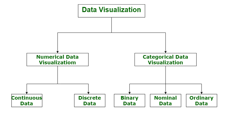
Categories of Data Visualization
Data visualization plays a crucial role in market research. It helps show both numbers and categories in a way that makes insights more powerful and reduces the risk of overthinking analysis.
- Graphs
- Charts
- Maps
Now let’s talk about a few of data visualization’s benefits.
Benefits of Visualisation of Data
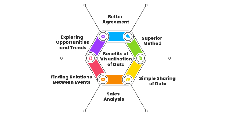
Better Agreement: When comparing the performance of two components or situations in business, analysing a large amount of data can be time-consuming. However, data visualization simplifies this process by representing the data in a visual format, making it easier for everyone involved to understand and come to an agreement. For instance, comparing sales figures of two products becomes easier when represented graphically, allowing for better decision-making. If you’re keen to enhance your data visualization skills, consider enrolling in a Data Science Course in Bangalore to gain practical insights and expertise.
A Superior Method: Data visualization helps convert complex data into a visual format, providing a clearer understanding of the information at hand. Platforms like Google Trends use graphical representations to illustrate data related to popular searches or trends, making it easier for users to grasp the information and interpret the information quickly.
Simple Sharing of Data: Data visualization introduces a new form of communication within organizations. Rather than sharing cumbersome data, visual representations make it easier to convey complex information in a more accessible and engaging way. This aids in better understanding and decision-making across teams and departments, facilitating smoother communication and collaboration.
Sales Analysis: Data visualization tools enable salespersons to comprehend product sales trends effortlessly. Using tools like heat maps, salespeople can identify the factors contributing to both the increase and decrease in sales. Data visualization helps understand customer preferences, repeat purchases, the impact of geographical locations, and other relevant factors, thus aiding in comprehensive sales analysis.
Finding Relations Between Events: Businesses are influenced by various factors, and understanding the relationships between these factors is crucial for effective decision-making. For instance, in the e-commerce industry, sales typically surge during festive seasons like Christmas or Thanksgiving. Through data visualization, businesses can quickly identify correlations between such events and their corresponding impact on sales figures, helping them plan better for future events.
Exploring Opportunities and Trends: Data visualization enables business leaders to uncover the intricacies of customer behavior and identify emerging patterns and opportunities. By analyzing patterns and trends using visual representations, experts can extract meaningful insights from large datasets, give them to make informed decisions and capitalize on emerging opportunities in the market.
Overall, if you want to start a career as a data scientist, Data Science Interview Questions and Answers can assist you in improving your abilities and knowledge. This provides answers to all of the questions that may arise during your data science interview.
Drawbacks of information visualisation
Can be time-consuming: Data visualization involves the process of transforming complex data into visual representations, which can be a laborious task, especially when dealing with large and intricate datasets. Creating meaningful and accurate visualizations often requires meticulous attention to detail, data cleaning, and careful selection of appropriate visualization techniques. This process can consume a significant amount of time and effort, potentially slowing down the overall workflow, particularly in machine learning and data analysis tasks where efficiency is crucial. To streamline your data handling and visualization processes, you might consider honing your Python skills through a Python Course in Bangalore, equipping you with the necessary tools to expedite your data-related tasks.
Can be misleading: While data visualization serves as a powerful tool for identifying patterns and relationships within data, it can also lead to misleading interpretations if not executed with care and precision. Visual representations, if not based on a thorough understanding of the underlying data and its context, can inadvertently suggest patterns or trends that do not actually exist. This can mislead analysts and decision-makers into drawing inaccurate conclusions, potentially leading to misguided actions or strategies that may not align with the actual insights derived from the data.
Can be difficult to interpret: Some forms of data visualizations, especially those involving complex 3D graphics, intricate interactivity, or advanced visual elements, can pose challenges in terms of interpretation and comprehension. Complex visualizations can overwhelm users, making it difficult for them to extract meaningful insights from the data. Users may struggle to understand the underlying message or relationships depicted in the visualization, leading to confusion and potential misinterpretation of the data, which can hinder effective decision-making.
May not be suitable for all types of data: While data visualization is a powerful tool for representing and analyzing various types of data, it may not be suitable for certain data formats, such as textual or audio data. Textual data, for example, often requires techniques like natural language processing for analysis, while audio data may require specialized processing techniques for effective interpretation. Attempting to represent these data types through traditional visualization methods may not yield meaningful insights, necessitating the use of alternative analysis techniques tailored to the specific characteristics of the data.
May not be accessible to all users: Data visualizations primarily cater to visual perception, which can pose challenges for users with visual impairments or other disabilities. Visual elements, such as color-coded charts or graphs, may not be usable to users who rely on assistive technologies or alternative forms of data presentation. To ensure inclusivity and accessibility, it is essential to consider alternative methods of data presentation, such as descriptive text, audio descriptions, or tactile representations, that accommodate a diverse range of users with varying abilities and needs.If you want to know more about the latest salary trends for data scientist, Check out Data Scientist Salary For Freshers, which will help you get an insight into the packages as per the companies, skills and experience.
The most crucial query now comes up. What Makes Data Visualization Such a Big Deal?
Why is Data Visualization Important?
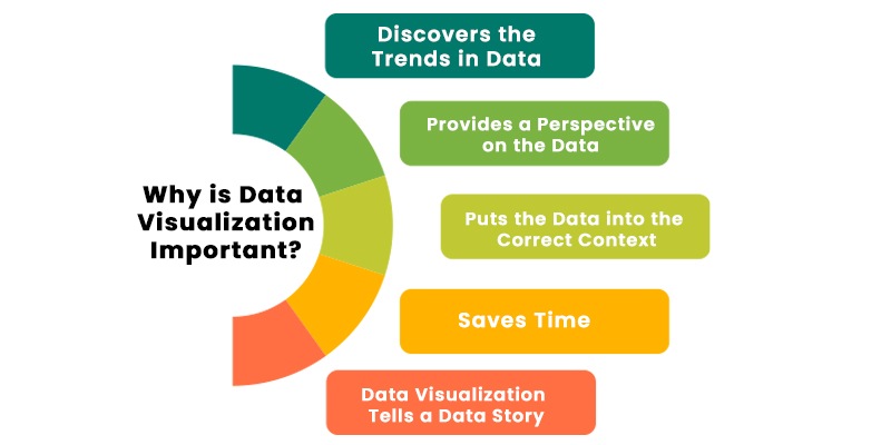
Data visualization helps in the presentation of tales of a company by transforming data into a more understandable format and showing trends and outliers. A good visualization conveys a story by reducing noise from data and emphasizing important information.
1) Data Visualization Discovers the Trends in Data
Data visualization plays a crucial role in uncovering trends within datasets. By representing data visually, it becomes easier to identify patterns and trends compared to viewing data in a tabular format. Visualizations enable users to perceive trends quickly and effortlessly, facilitating a better understanding of the data’s underlying patterns and relationships.
For instance, consider the use of data visualization software like Tableau, which can present data in a graphical format. Using colors to represent different values, such as red for losses and grey for profits, allows for quick identification of profit or loss trends. Visualizations, such as bar graphs or charts, can help highlight specific data points or trends that might not be immediately evident when analyzing data in a traditional tabular format. This visual representation aids in the swift recognition of important insights, enabling stakeholders to make data-driven decisions effectively. By revealing trends at a glance, data visualization empowers organizations to proactively respond to emerging patterns and take strategic actions to optimize their performance and outcomes. If you’re interested in delving deeper into data visualization techniques, you might want to explore a Python Course in Pune to enhance your skills and proficiency in data handling and visualization.
2) Data Visualization Provides a Perspective on the Data
Data visualization offers a perspective on data by placing it within the context of the broader data landscape. By visually representing the relationship between different data points, it becomes easier to understand the significance of specific data references in relation to the overall data picture.
For example, data visualizations can effectively showcase how specific metrics, such as sales and profits, correlate with each other. By presenting these metrics in a visual format, the visualization provides a clear perspective on how changes in one metric impact the other, thereby revealing any patterns or discrepancies that might not be immediately evident from a tabular representation of the data.
In the context of the provided visualization, the graphical representation of the relationship between product sales and profits highlights the distribution of data points across the two measures. This visualization emphasizes that a higher volume of sales does not necessarily equate to higher profits, indicating potential areas where the business may need to focus its efforts to optimize profitability. By providing a comprehensive view of the data relationships, data visualization enables stakeholders to gain valuable insights into the dynamics of the data, facilitating informed decision-making and strategic planning.
3) Data Visualization Puts the Data into the Correct Context
Data visualization plays a critical role in contextualizing data by providing a comprehensive understanding of the circumstances surrounding the data. Contextual information offers a holistic view of the data, allowing stakeholders to grasp the complete picture that surrounds the data points, which is often challenging to comprehend solely by examining numbers in a table.
For example, the use of data visualization tools like Tableau enables the creation of visualizations, such as a TreeMap, to represent data within a specific context. Visualizations like TreeMap effectively showcase data points in relation to each other, making it easy to comprehend the distribution of data across different categories or regions. In the provided visualization, the use of a TreeMap clearly indicates that California has the highest number of sales compared to other regions in the United States, as evident from the size of the rectangle representing California.
Understanding such contextual information is vital for making informed decisions and developing strategies that cater to specific regions or areas of focus. Data visualization facilitates a deeper understanding of the broader context of the data, enabling stakeholders to identify key trends, patterns, and opportunities, and make data-driven decisions that align with the overall organizational objectives and goals.
4) Data Visualization Saves Time
Data visualization significantly reduces the time required to extract meaningful insights from complex datasets compared to traditional methods of data analysis. Visual representations enable users to quickly identify patterns, trends, and outliers within the data, streamlining the process of data analysis and decision-making.
For instance, utilizing data visualization software like Tableau facilitates the creation of visualizations, such as a heatmap, to represent data in a visually intuitive manner. The use of colors, such as red to denote losses, makes it easy to identify states that have incurred a net loss, thereby accelerating the process of identifying critical information from the dataset. In contrast, analyzing the same information in a traditional tabular format would require manual inspection of each cell to identify negative values, making it a time-consuming task.
By enabling quick and efficient data analysis, data visualization saves valuable time and resources, allowing stakeholders to focus on interpreting insights and making informed news decisions rather than spending time on manual data examination. Data Analytics Course in Chennai will help you to gain expertise in data visualization tools and techniques. The time saved through data visualization can be effectively utilized for strategic planning and implementing data-driven strategies that contribute to the overall success and growth of the organization.
5) Data Visualization Tells a Data Story
Data visualization serves as a powerful medium for conveying a narrative that engages viewers and conveys a coherent message. Visualizations can be used to present complex data in a structured and easy-to-understand format, guiding viewers through a narrative that leads to a clear and logical conclusion. Similar to any other storytelling format, effective data visualization tells a compelling data story by presenting information in a well-defined sequence that captivates the audience’s attention and leads them to a meaningful takeaway.
For instance, in the context of a business scenario, a data analyst might use data visualization to craft a presentation for company executives, outlining the profits and losses associated with various products. The data story presented through the visualization could begin with an overview of the performance of different products, highlighting key insights and trends. As the visualization progresses, it could offer detailed analysis and recommendations on how to address any losses, emphasizing potential strategies or actions to improve overall profitability.
By structuring the data visualization as a narrative, the data analyst can effectively convey the significance of the data, its implications, and the recommended course of action to the audience. This approach not only facilitates better understanding but also fosters engagement and empowers stakeholders to make informed decisions based on the insights derived from the data story. If you’re keen on enhancing your programming skills to complement your data analysis capabilities, you may want to explore some of the Best Big Data Analytics Training Institutes in Chennai to gain a solid foundation in Java programming and expand your technical expertise.
Top Data Visualization Tools
The top ten Data Visualization tools are shown below.
- Tableau
- Looker
- Zoho Analytics
- Sisense
- IBM Cognos Analytics
- Qlik Sense
- Domo
- Microsoft Power BI
- Klipfolio
- SAP Analytics Cloud
Data visualization Libraries
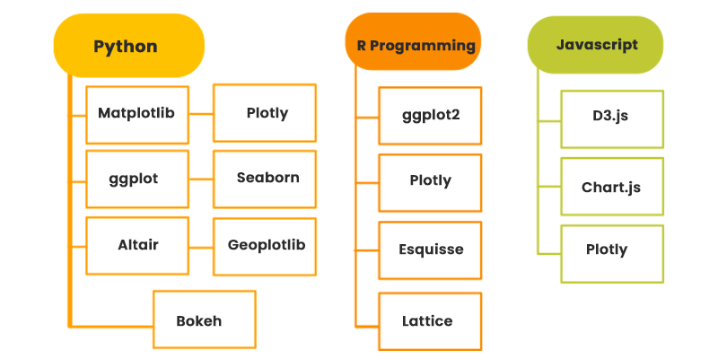
Here are some of the top data visualization libraries available in Python, R, and JavaScript:
Python
Matplotlib: A comprehensive library for creating static, animated, and interactive visualizations in Python.
Plotly: An interactive graphing library that enables the creation of complex, interactive visualizations.
ggplot: An implementation of the Grammar of Graphics in Python for creating declarative graphics.
Seaborn: Built on top of Matplotlib, Seaborn provides a high-level interface for creating attractive statistical graphics.
Altair: Declarative statistical visualization library for Python, based on Vega and Vega-Lite.
Geoplotlib: A geospatial data visualization library that specializes in the visual exploration of geographic data.
Bokeh: A powerful library for creating interactive and browser-based visualizations.
R Programming
ggplot2: An implementation of the Data Analysis in R for creating customized and publication-quality visualizations.
Plotly: A popular library for creating interactive and shareable visualizations in R.
Leaflet: An open-source JavaScript library for interactive maps, widely used in R for geospatial data visualization.
Esquisse: A graphical user interface for ggplot2, facilitating the creation of plots using a drag-and-drop interface.
Lattice: A powerful and versatile R package for creating conditioned plots and other complex visualizations.
JavaScript
D3.js: A popular JavaScript library for manipulating documents based on data, enabling the creation of custom and interactive visualizations.
Chart.js: A simple and flexible JavaScript charting library for creating responsive and customizable charts.
Plotly: A versatile data visualization library available for JavaScript, offering interactive and publication-quality visualizations.
